Define what the “code name” of the branding is.
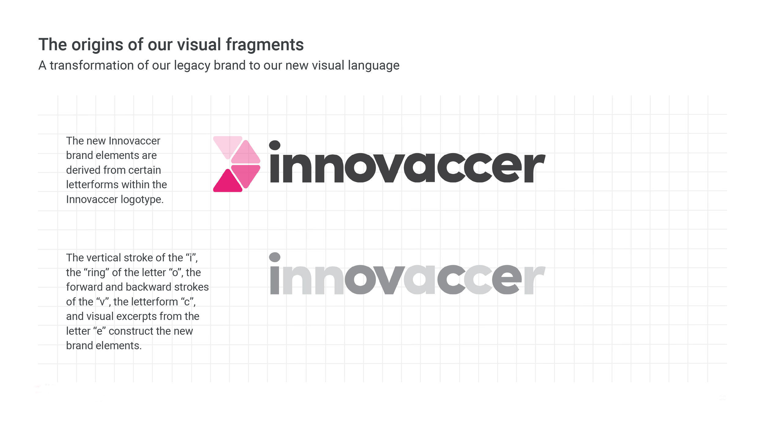
Since the project was not about changing the corporate logo, we took visual cues and forms from the actual letterforms for the identity system within the wordmark.
By visually dissecting the letterforms, distinctive shapes visually define Innovaccer and provide graphic tools in which to apply toward consistent visual graphic compositions. Here the concept for “fragments” are meant to visually depict random data.
The fragments were further used to construct health “care symbols” to augment the overall system and to solidify the industry Innovaccer is designed to aid.
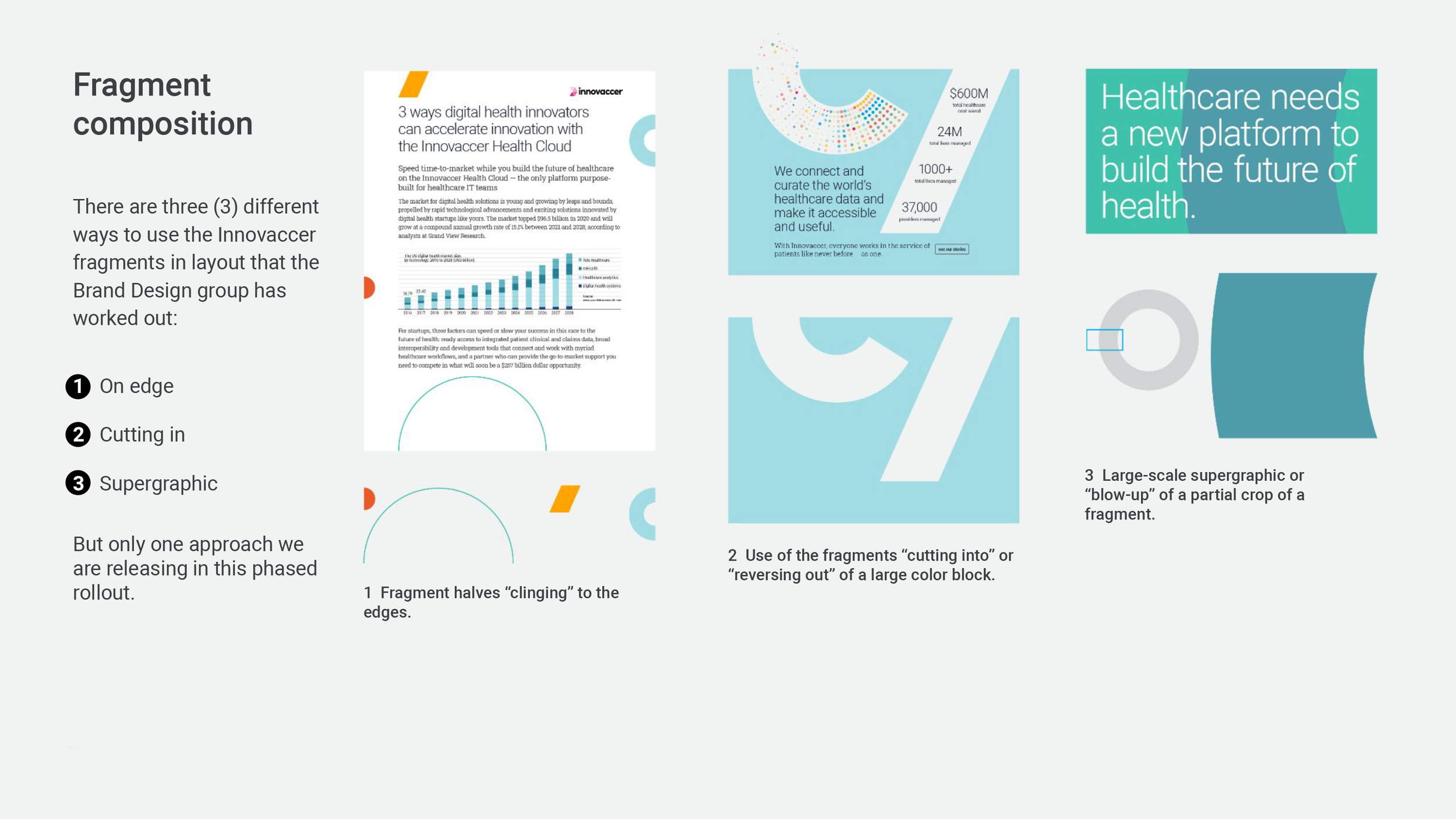
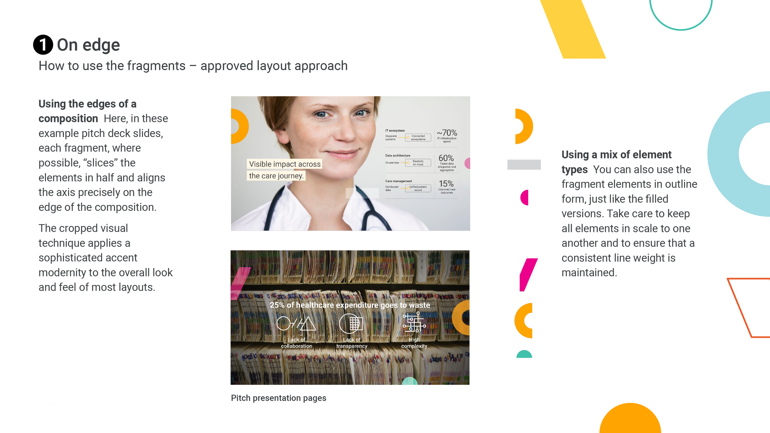
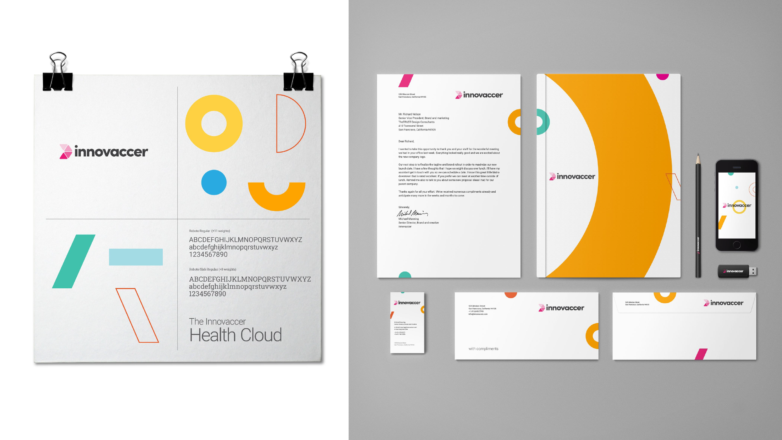
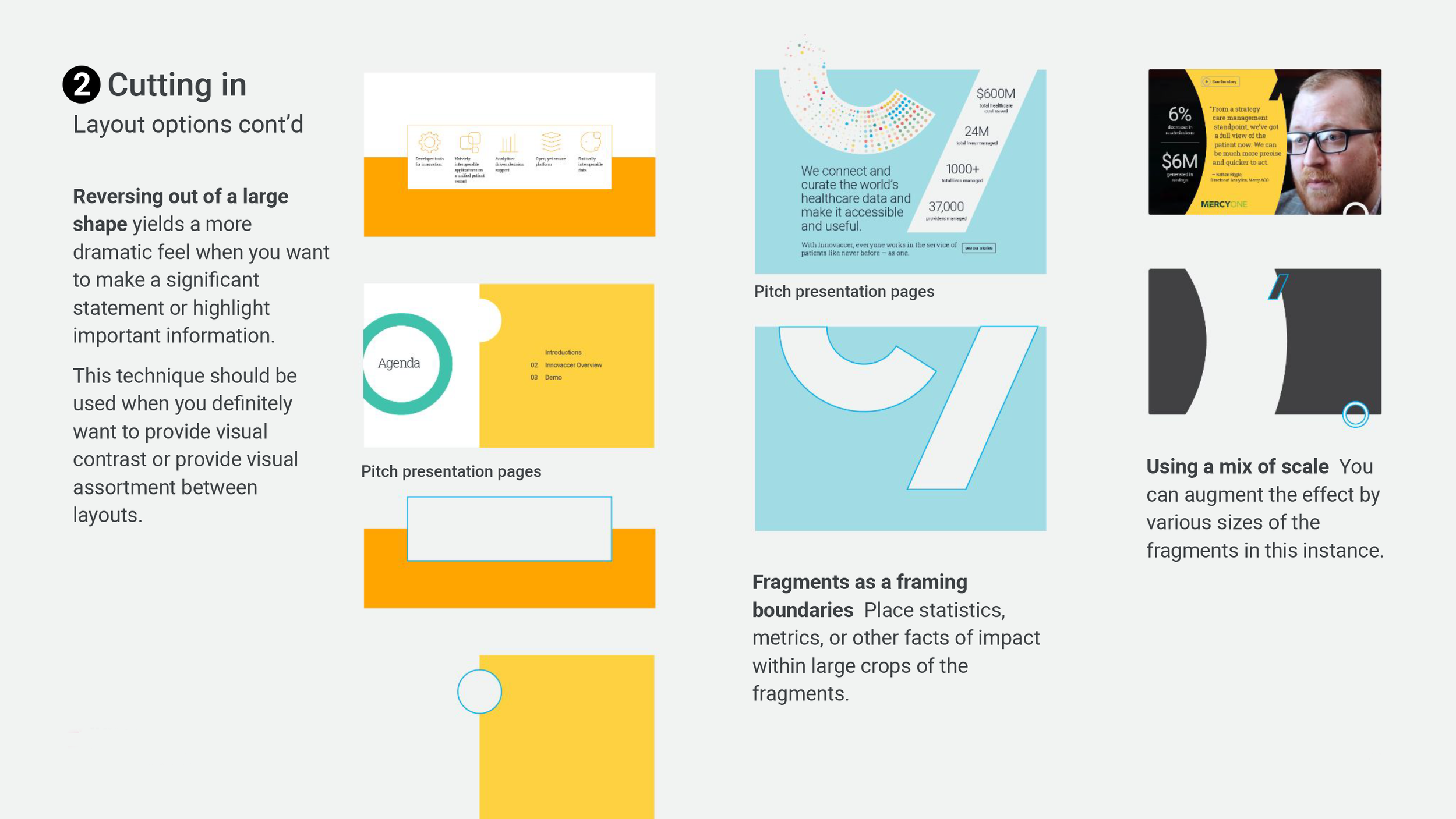
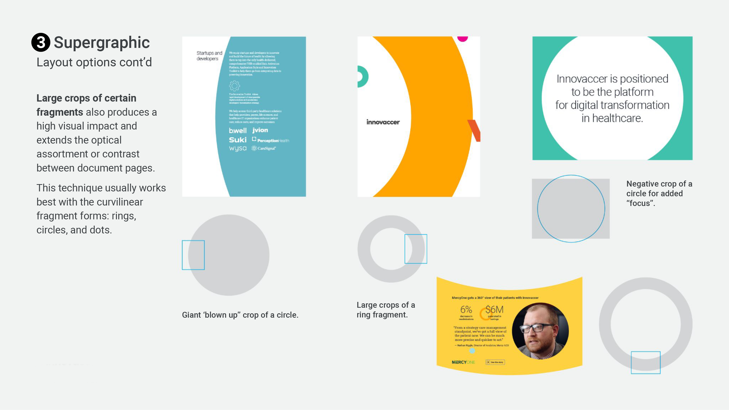
The fragments were categorized into three (3) distinct combinations to provide visual identity texture so the system didn’t appear too “rigid” in its approach.
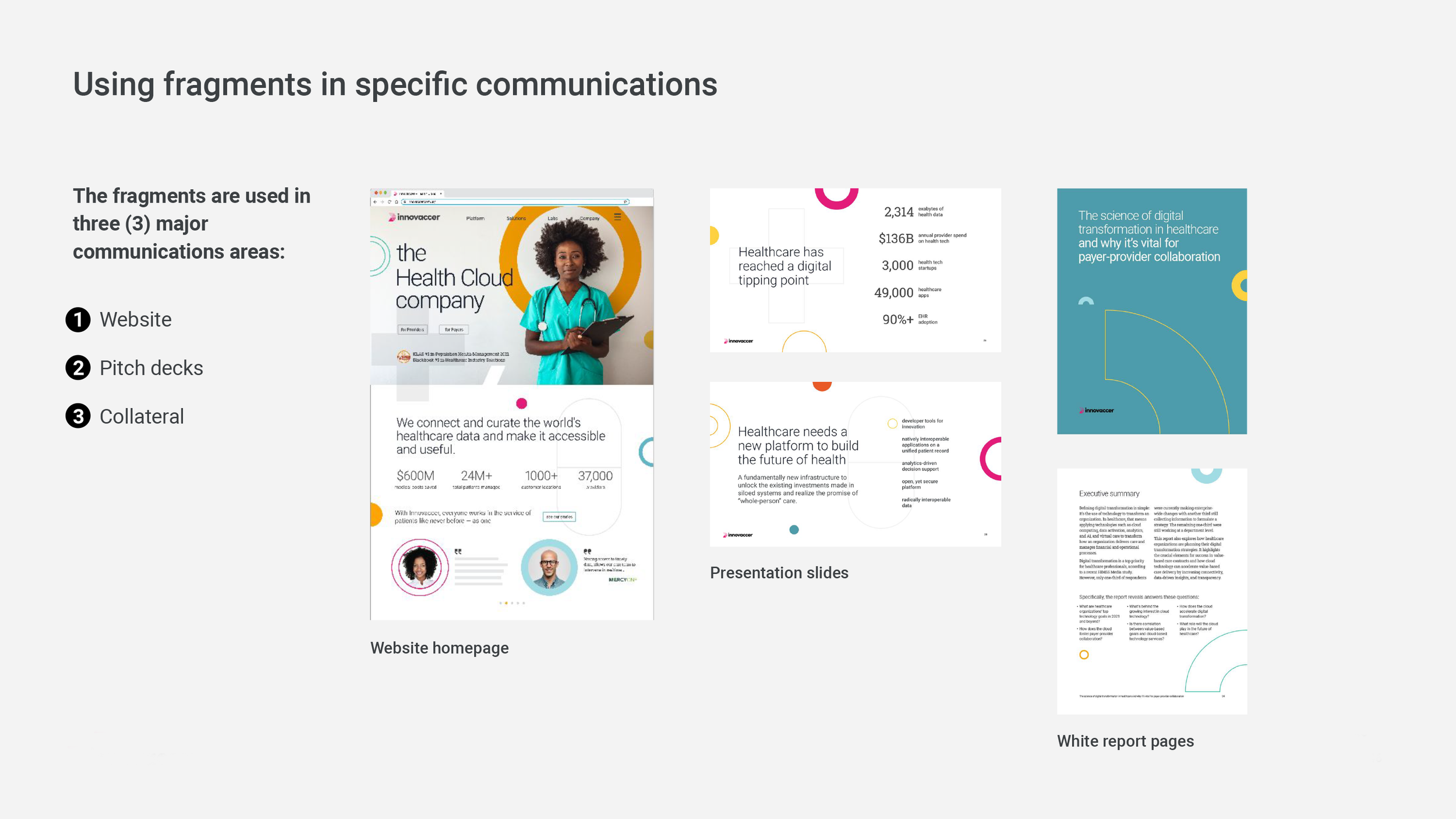
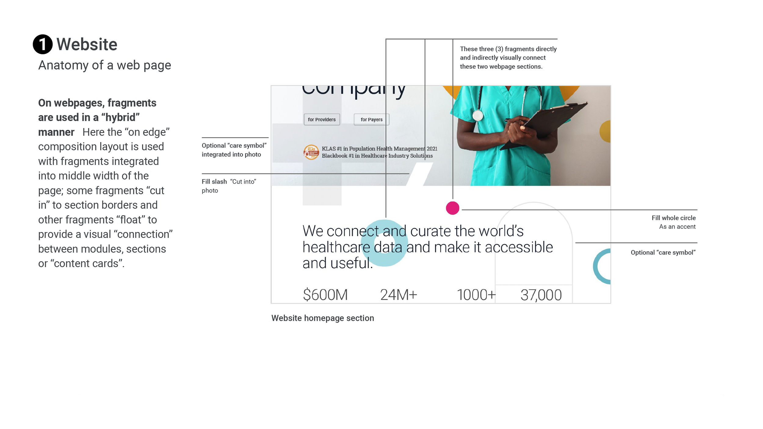
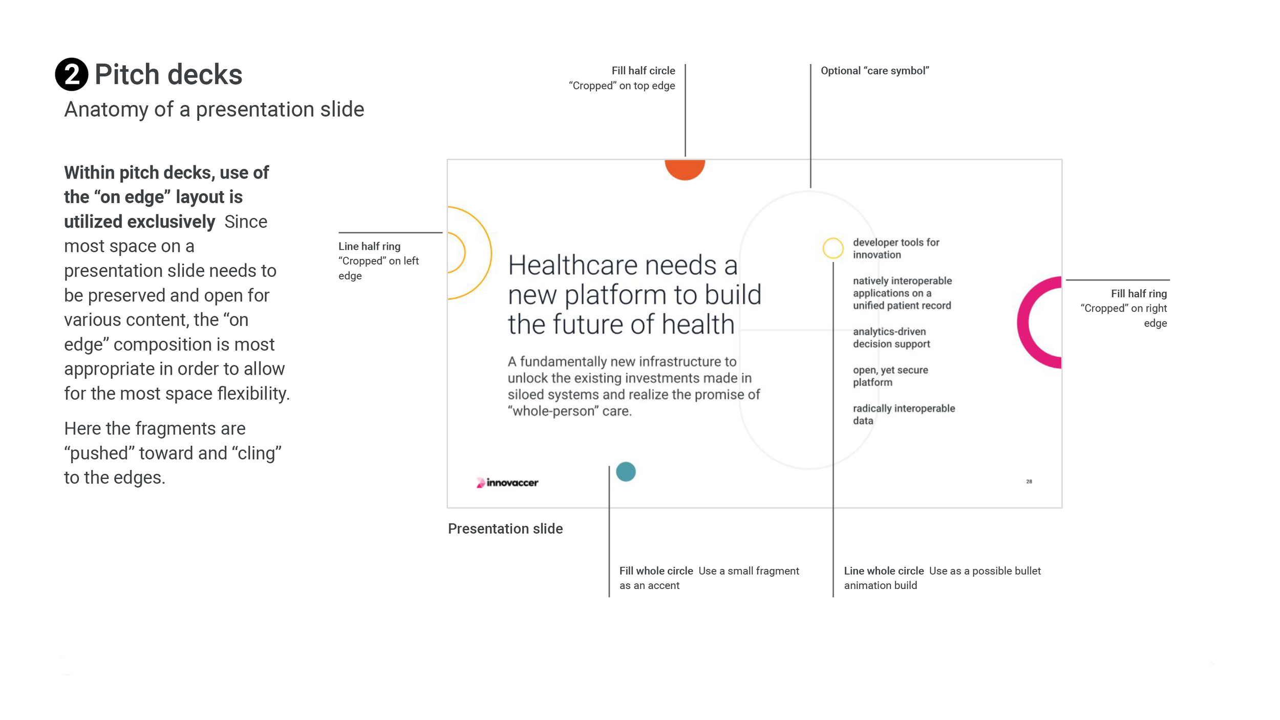
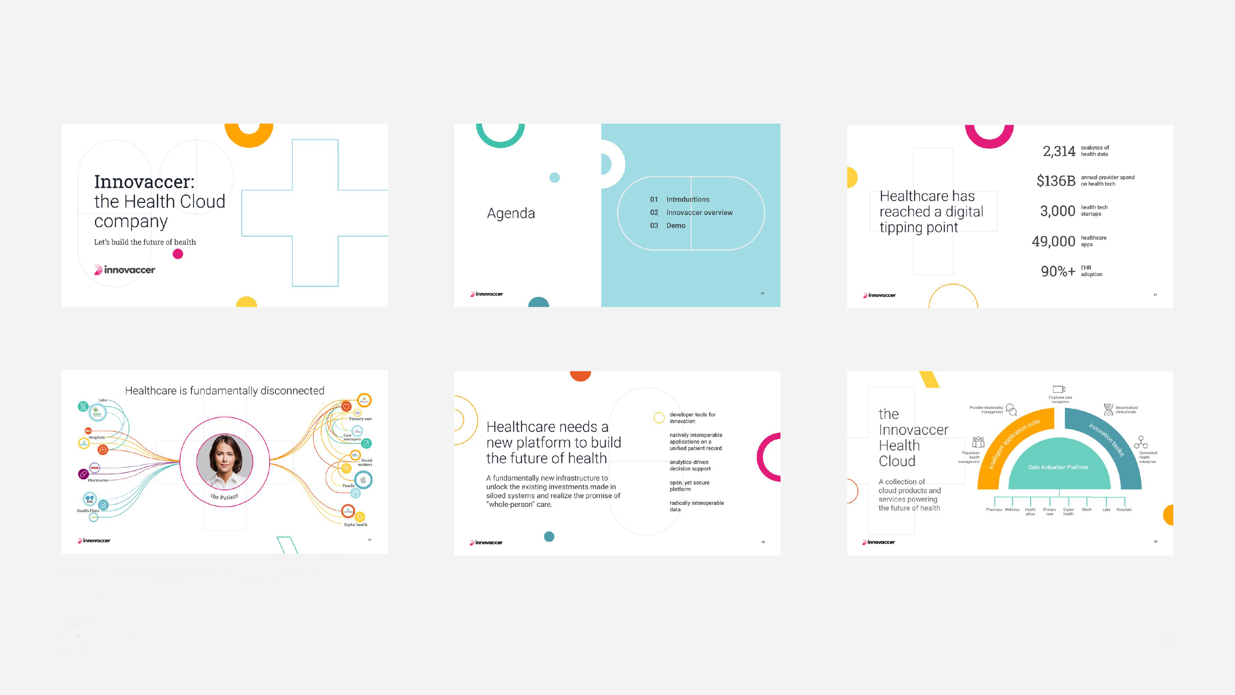
Further guidelines were prescribed toward “real world” executions like the corporate website and presentation decks.
Within presentation decks where we were using Google Slides, additional guidance was provided on how to manufacture the “fragments” within the “shapes” palette.
The corporate color palette was expanded and divided into the sales groups: providers, payers, and life sciences.
Expanding the color palette over photography and within the “fragments” whether it be super graphics or patterns, shows how flexible the design system can be toward an assortments compositions.
A minimal, line-based iconography style was prescribed to visually complement the “fragments”.
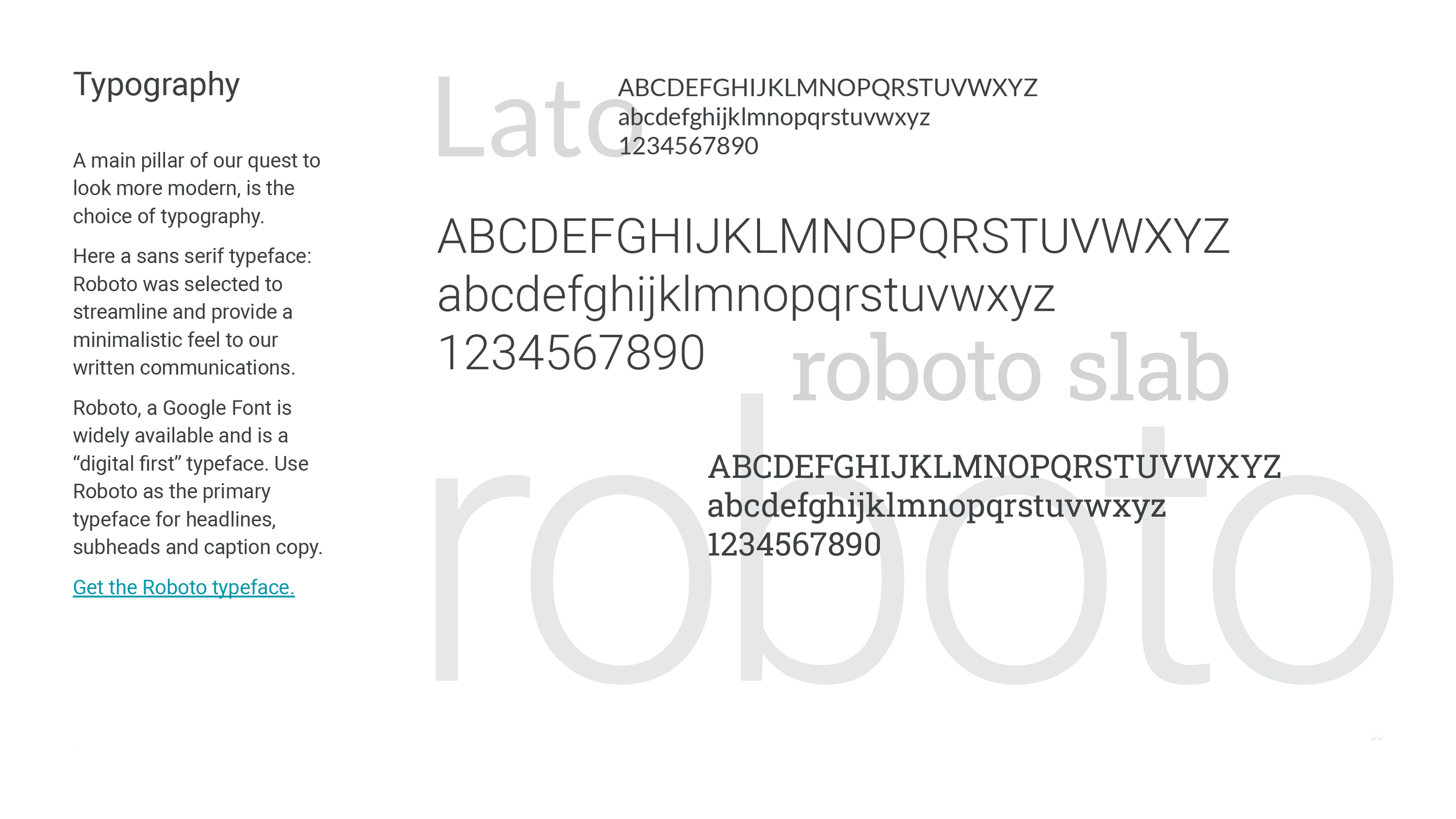
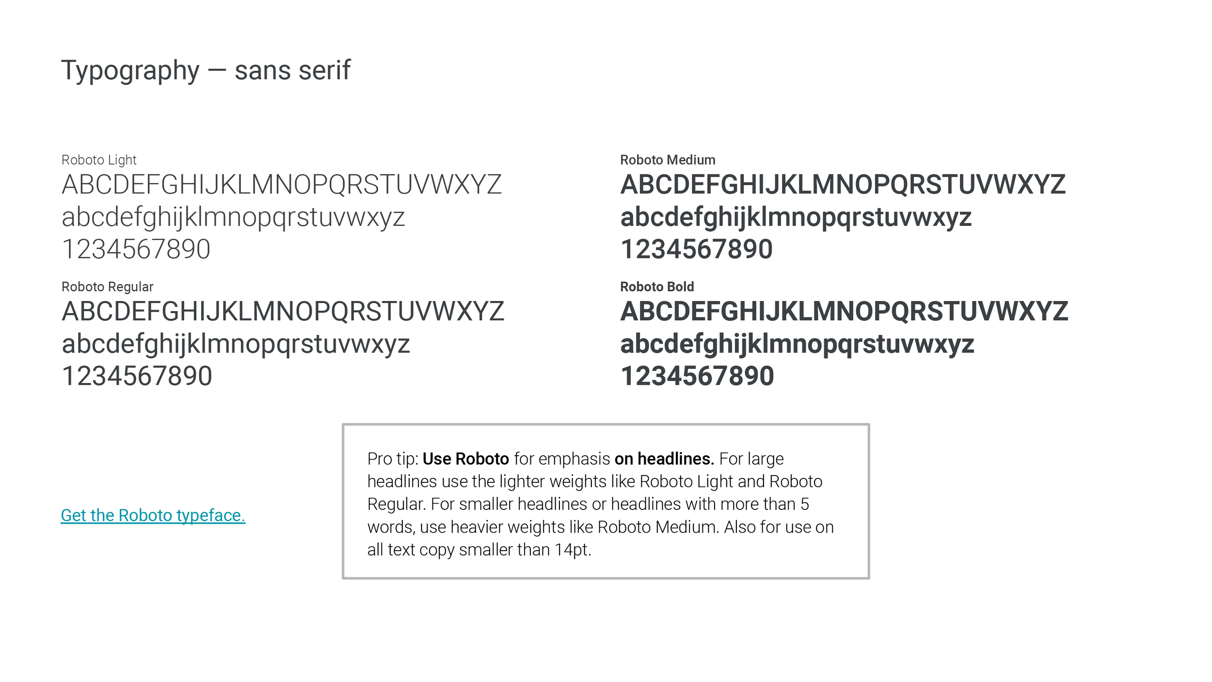


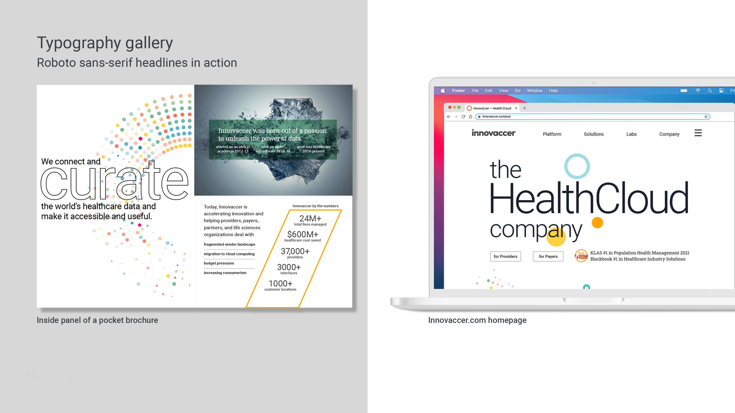
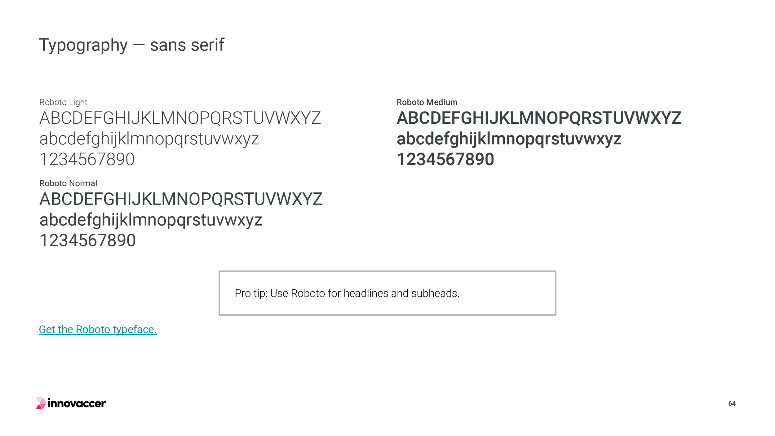
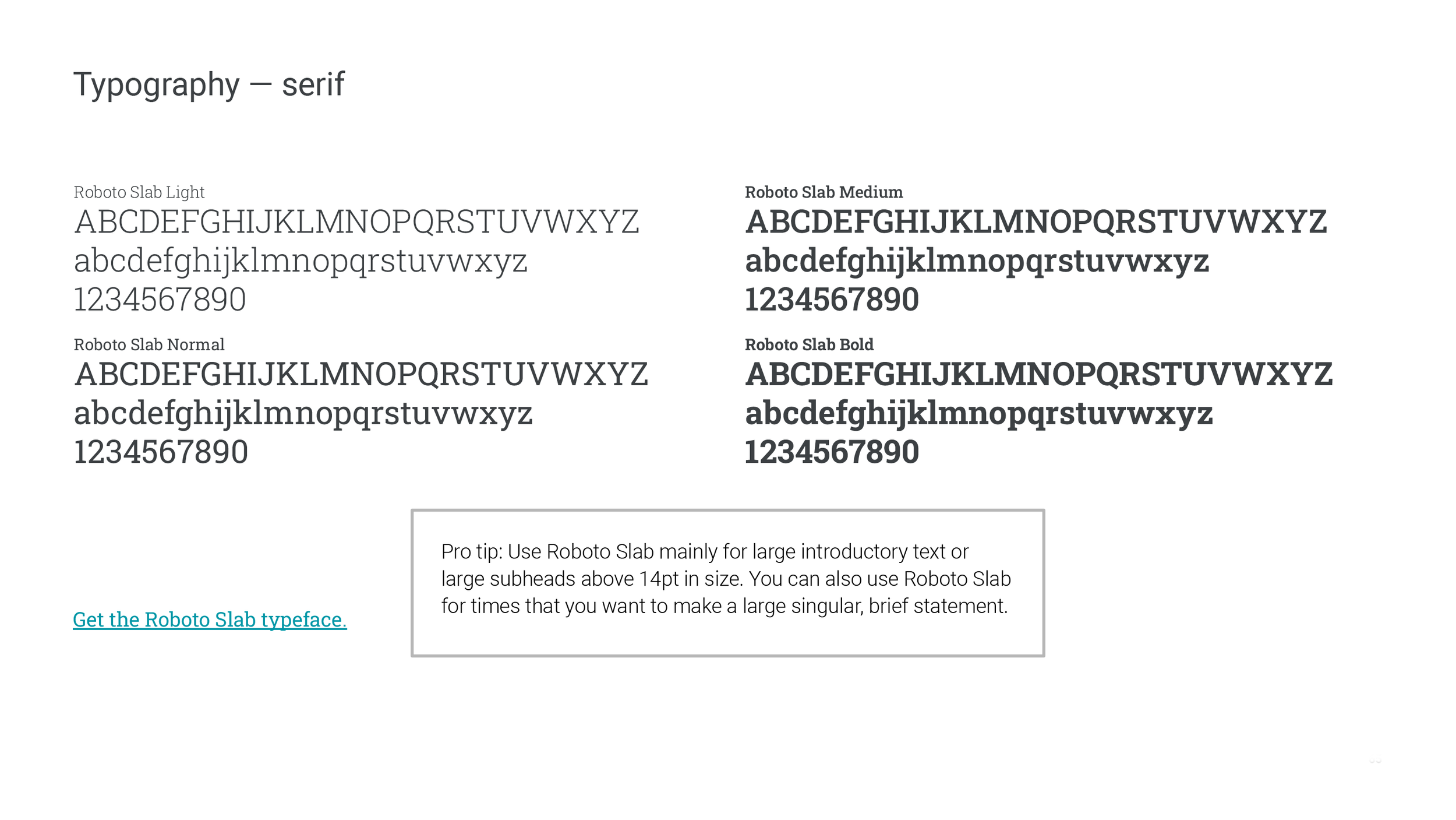

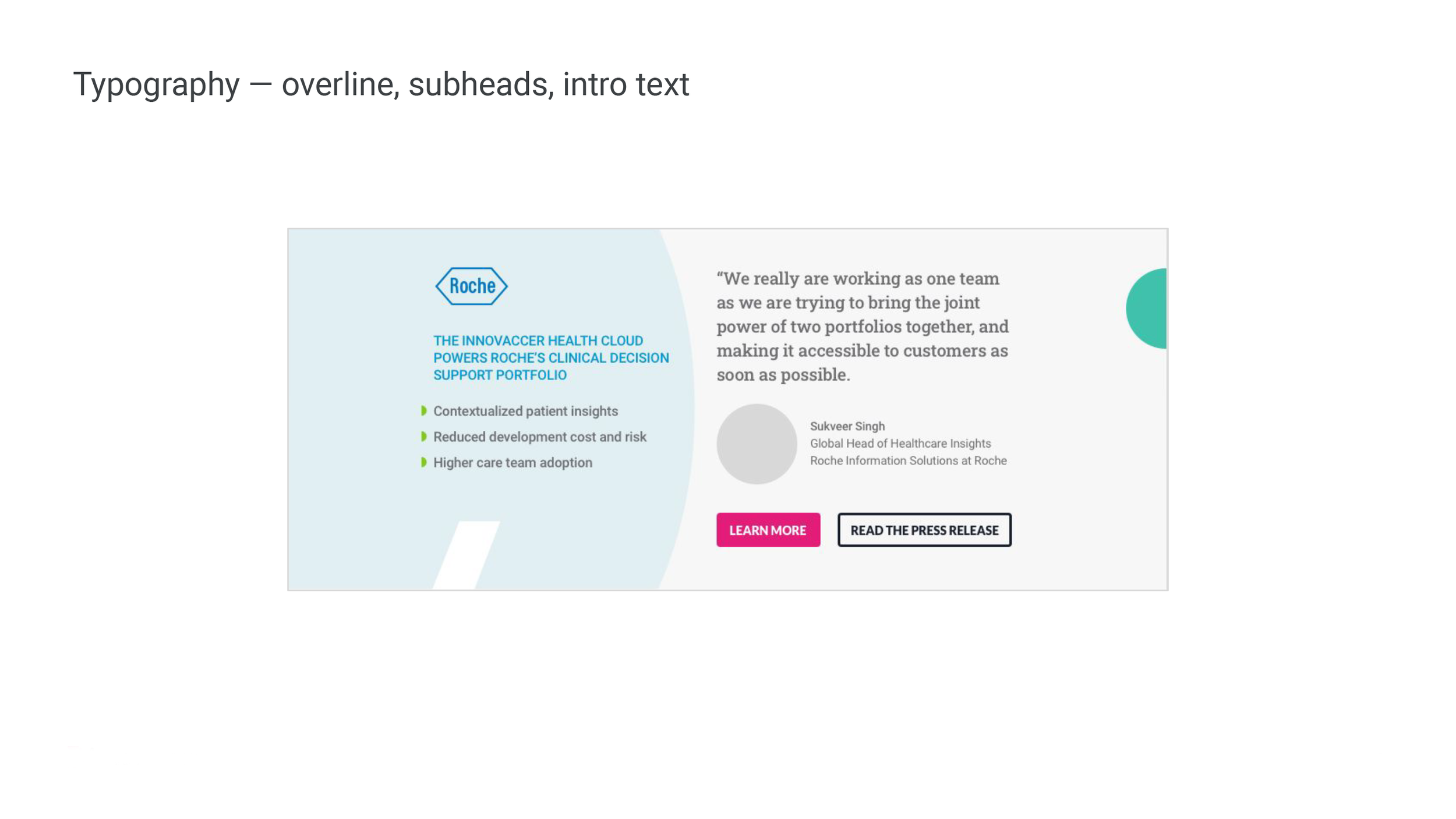
Typography is a main pillar of brand design and one that underpins most visual efforts within the new Innovaccer brand. Here, two styles from Google Fonts, Roboto Sans and Roboto Slab compliment the minimalist feel of the new aesthetic. Additionally, we created “type recipes” as a visual guide in how to combine the two fonts.
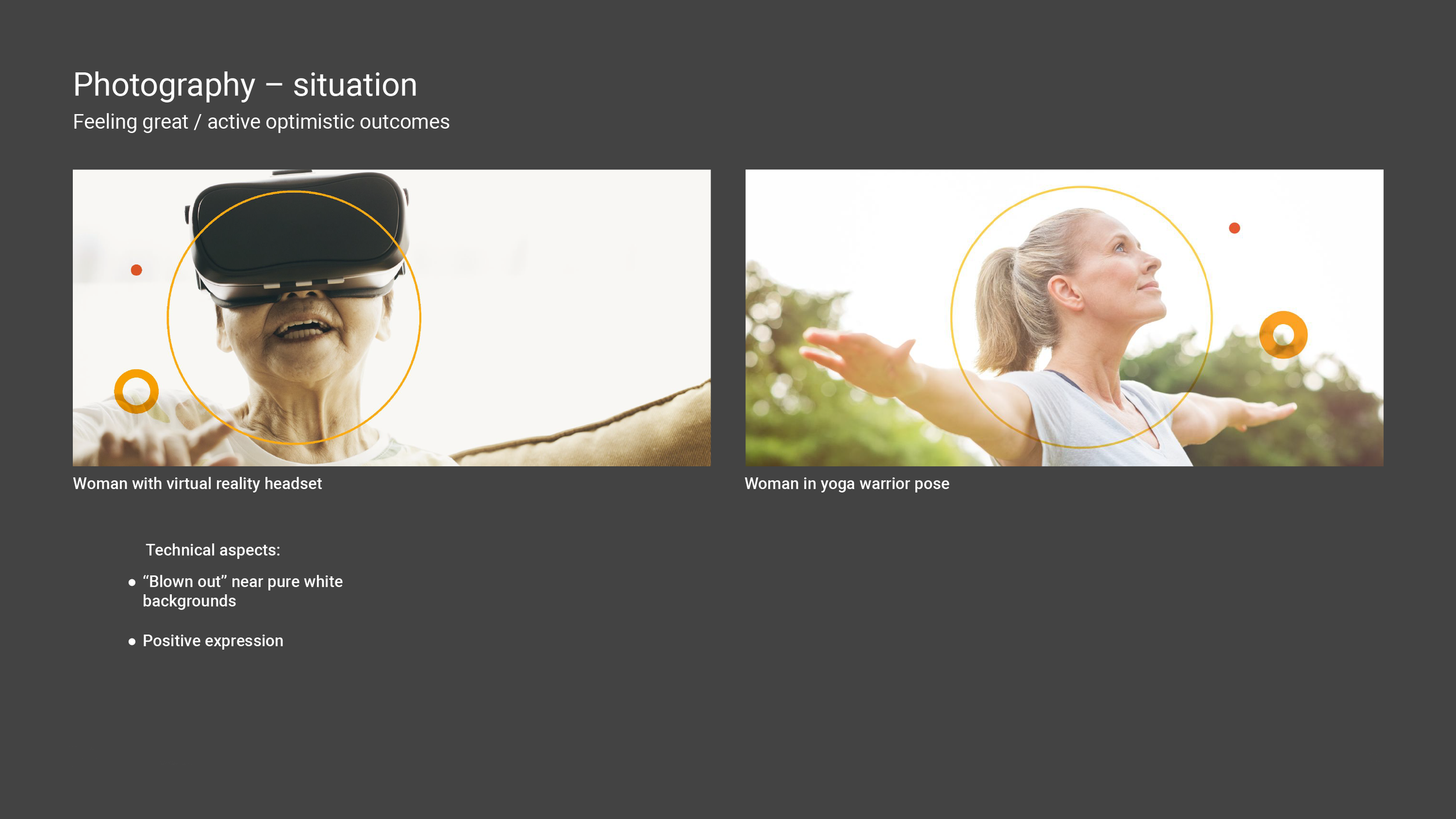
Within photography, good mix of authentic, believable human expressions and medical still life combined with ring graphic “fragments” create a dynamic visual direction for Innovaccer brand exetension.
